Responsive Web Design: Why it is Important and What are the Advantages
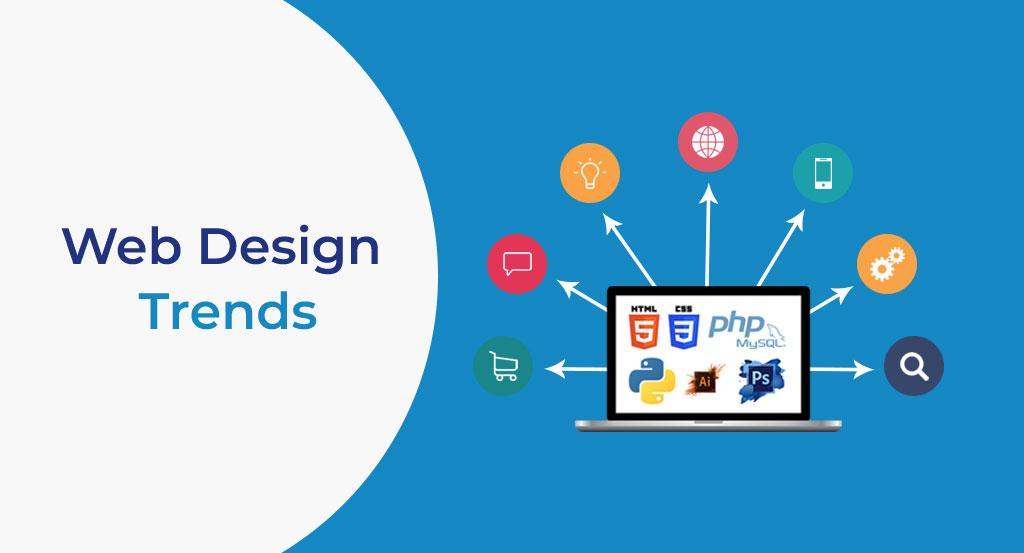
Success of a website depends a lot on its design and appearance. Vivid and adjustable graphic, creative content and spectacular design offers a rich look to website. In current time, Responsive design is in great demand due to evolution of Smartphone era. If we make it more technically, it is a web design and development technique optimizes a user browsing experience on device by producing a flexible and responsive web page.
Importance of Responsive Web Design:
The days are gone when people use heavy desktop to browse the internet. Now people are using Smartphone for their daily internet surfing therefore, it is necessary to implement responsive web design that respond user according to its device size and offers the best web browsing experience. Why Responsive design becomes essential can be ascertained from the following facts.
Smartphone Facts:
According to a well-known research done in USA and the figures are reveled, opens the new door for effective responsive web design. There are-
• 45% of USA citizens have Smartphone and 90% use their phone for online shopping and other web activity.
• If we talk about mobile internet then the figure have crossed 2.1 billion users.
• 64% of Smartphone users read news online instead of reading newspaper.
• 74% users dump the website if it takes more than 5 second to download.
• USA citizen spend 1.4 hours daily on mobile web surfing.
What forms Responsive Design?
It is not a piece of technology but a blend of innovative techniques and ideas. Responsive web design works on mix of flexile grids and layouts, images and smart use of CSS media queries.
Flexible Grids:
Flexible Grids go beyond the traditional fixed width set up that offer expansion of pages with huge screen resolutions instead of resolution with rigid pixels. In old design all layout design were counted in pixels but since the fluid grid has come, all the design set up consider percentage-based designs. In Fluid Grid, the grid is divided into a specific number of columns to get easy and clean design outline. Then each element is set with proportional width and height so whatever the device is, elements will adjust with their width and height according to Smartphone screen. In old design pattern, A design with three-column, which will not work on a small screen mobile but CSS3 Media Query can solve a hurdle that is our next point.
CSS3 Media Queries:
CSS3 media queries include media type and media features that allow content delivery at adaptable conditions. CSS3 (Cascading Style Sheets) Media Queries helps in collecting visitor’s data and use it in applying conditional internal and external stylesheets that are based on width and height. With CSS3, we can target specific screen sizes with diverse blocks of CSS code for dissimilar screen and device sizes. CSS3 Media Queries considers height and width of the device and browser, screen resolution, and orientation of device. CSS3 allows multiple screen resolution and readjust according to size of the phone.
Fluid Image:
Fluid image uses in responsive design carries flexible width size that can grow or shrink according to website container. It can generate small resolution image according to mobile browsing and the image’s aspect ratio remains the same. There are two methods for image size: overflow and max-width-100%. Out of them overflow can hide image parts that are bigger than site container while max-width-100% can constrain the image as the dimension of container modifies.
Advantages of Responsive Web Design:
Responsive web design is beneficial to users and the businesses. We choose here some benefits that provide enhanced visibility and saves user time and cost also.
Enhance Visibility:
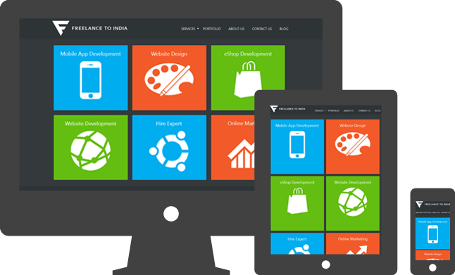
It can correspond to any device ranging from Smartphone to iPad hence it provides accessibility and more visibility to users. On the base of phone screen size, website can shuffle content, resize the image, and adjust font size for rich user experience.
Increase Conversation rate:
A user will have rich browsing experience in the context of functionality, performance, and reliability of responsive web design that helps to augment sales and conversation rate of that particular website. A site with CSS and integrated design approach induces user to remain longer time on site and it makes a positive impression on user’s mind about website that increases conversation as well sales ratio.
Reduce cost:
Using responsive web design, there is no need to run different websites across different platforms. Only a single web design can be extended to all types of Smartphone, desktop etc. As a result, development cost will be reduced that saves customers’ hard-earned money.
Beneficial to SEO:
Such web design is easy to update and can be optimized for all device. Google can index a website easily due to a single website platform. User can access website from any device that can reduce overall bounce rate. Being a single site there is no need to redirect website that helps to reduce website load time. It is easy to generate the content on a single website as it reduces chance of low quality content.
Responsive design places you ahead of your rivals, provides an innovative, and eye catching experience compare to traditional web design practice. A user- friendly web design can bring more traffic to website by reaching to as many users across the world.